The Gutenberg Takeover of WordPress

keep-calm-because Gutenberg takingover


The WordPress visual editor is getting a makeover and the majority of people do not like it. The Gutenberg addition, which scheduled to be integrated into WordPress 5.0 in November, currently has 860 872 one star votes. This is compared to 367  370 five stars votes (read this excellent review for one of the first complaints). Let’s try and explain why the WordPress team is going forward with the Gute (short for Gutenberg)  despite massive opposition.

Why do we need Gutenberg?

The reason behind the new editor is to give more control to non-developers by allowing them to create content blocks in the editor. According to Matt Mullenwig, there are a few challengers that WordPress needs to deal with; Squarespace and Wix. Gutenberg is the haymaker punch from the CMS heavyweight champion against these upcoming would-be challengers. There are also page-builder plugins that users can install such as Elementor and Divi Builder. According to many users, the Gute is lightyears behind these programs in terms of functionality and ease of use.

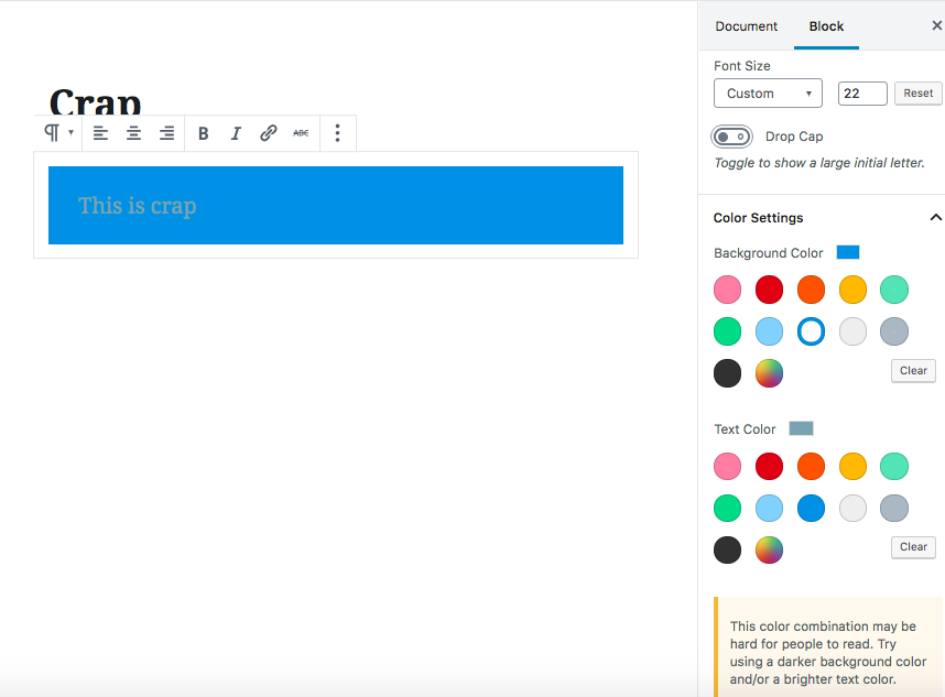
The editor lets you know if there is a text-background color contrast issue.
Screen Shot of Gutenberg

The WP team believes that the page-building power needs to be in the core. It’s also worth mentioning that the CMS Drupal also uses the concept of blocks in their admin UI. One assumes that there is fear that WordPress will be irrelevant in 5 to 10 years if the page-building ability becomes popular and is found elsewhere.  Blockbuster video was once the king of its domain years ago when it refused to adapt to the Netflix style of video rentals. Could this fall from the top also happen to WordPress? Watch this video for more information about the lessons of not adapting.

Why do people hate Gutenberg?

Users and developers do not like the Gute for a number of reasons.  Users, who are non-coders, are accustomed to using the standard editor. They love the simplicity and how easy it is to use and understand. The Gute on the other hand, is incredibly complicated.  There are over 24 keyboard shortcuts to learn and dozens of new features that users will need to get used to. Furthermore, it will continue to evolve and change so there will be more things to learn and understand in the future. Users would like to focus on making content and not on structuring the page layout. Humans prefer that some things stay simple and the WordPress editor is one of those things.

Screen Shot of gutenberg takeover crash

The fear developers have is in regards to plugins having been based on the default tinyMCEeditor. The new edition of the Gute will cause a poop-storm of incompatibility. The Gute is known to have a lot of bugs already and will possibly make whole websites go down (see image above). Developers will need to redevelop plugins and maybe even redo whole sites to make them compatible the Gute platform. This will inevitably cause a headache and has made considering non-Wordpress options more desirable than ever. ClassicPress is an exact replica of WordPress except it promises to never do the admin swticharoo. We hope that the WordPress ship will not go titanic on us and hope we can come to a peaceful resolution.

Understanding WordPress Errors

It’s an unfortunate part of life that WordPress Errors are going to happen. The good news is that there is always a solution to the problem. Figuring out what the problem is can be tricky and time-consuming. Just like you would call a plumber to help fix your leaking sink, you’ll need someone with WordPress skills to help when your website has a hole in it. Let us explain a little about what happens when we fix an error that’s on a site.

WordPress Errors on Apple-Mac-Computer

A known error to happen to WordPress sites is the 500 Internal Server Error. The number 500 is a status code that says this is a server-side type of error. In order to pinpoint where the problem is, we need to find where the file is that the issue stems from.

Every hosting company that is worth its weight in salt should have a server log with all activities happening on it. Among those activities are errors that arise which should be on the log file or a separate file called an error log. It is on the error log where we should find the exact line or lines of code that is causing the problem.

We at Critical Web Solutions have experience in fixing these errors quickly. Usually, the problem stems from the .htaccess file being improperly setup. Just by temporarily editing the file on the server, we sometimes can bring a site back up. Another place we check is the permissions on the folders and files on the server. We want to make sure that file/folder permissions are set to 644 and 755 to access them. If that doesn’t work, we will take a look the plugins installed. Instead of checking every plugin one by one, we rename the plugins folder so that WordPress core loads without any plugins at all. If this solves the problem, then it’s just a matter of fining out which plugin is the culprit.

There are numerous other WordPress errors that can arise. Issues such as a database connection failure or a php configuration error can be easily solved. You just need the right people with the tools to go in and take care of business. Contact us if you have an issue and we’ll make sure your site is back to normal fast.

GET HELP

What is Responsive Web Design?

Responsive Web Design was a coin termed by web designer Ethan Marcotte and he has written two books on the subject, A Book Apart, Responsive Web Design and Response Design: Patterns and Principles. Responsive web design suggests that a web page be adaptable to a user’s device screen size and their environment and behaviour. This approach is more efficient than designing a different web page or website per device, rather web designs are programmed to automatically adjust to and accommodate to the user.

Why Responsive Web Design?

Designing a web page is usually done on a desktop computer. When the web site is then viewed on other devices, for example tablets or mobile phones, the web page may not exactly fit the screen as expected, since it was designed for the proportions of another sized screen. Screens on a tablet may also be rotated, and these orientations are completely different to the proportions of a desktop computer. Websites should always be easy to use, and a lack of compensation for use on alternative screens may result in information chopped off the edge of the screen or images becoming partly unviewable. There are too many different screen sizes to build customised adjustments for every single one. In comes responsive web design. With responsive web design, CSS and HTML is used to resize, hide, shrink, or relocate content in order for the site to be functional and aesthetically intact on any sized screen.

Fluid grid & Flexible images

There are a few techniques in practice to change the format of the screen to accommodate the screen size as shrinking and squeezing content into place is not always desirable. Examples of these techniques are, hiding and revealing portions of images, creating sliding composite images and foreground images that scale with the layout. Even in these fixes, the outcome is not necessarily perfect for every size of screen. Fluid grid is a technique first recommend by Ethan Marcotte where an image should be resized relatively, rather than pixel determined, according to the size of the screen using CSS to support relative size adjustment. There are even options to fix resolution rendering issues. The Filament Group has presented recommendations where the size of the image also shrinks resolution for smaller screens so that the quality of the image remains intact.

Media queries

Media queries allow the page to use different CSS style rules, determined by the features of the device in use. This means creating multiple style sheets and basic layout customisations for a wide variety of screen widths, including the orientation of the page.

Now we know…

Ethan Marcotte has recommended that fluid grid, flexible images and media queries are three key elements in responsive web design. These techniques have been put into practice with great success and are a great leap forward in our use of the flexibility of code. Media queries will improve the web design within the various contexts for web site viewing. Instead of designing specifically for a device screen, we can adjust code so that customisation is automatic.